
How to implement multi-factor authentication in Salesforce
March 15, 2021
Finally Master Salesforce: Outsourcing Companies, Consulting, Admin-as-a-Service
February 26, 2024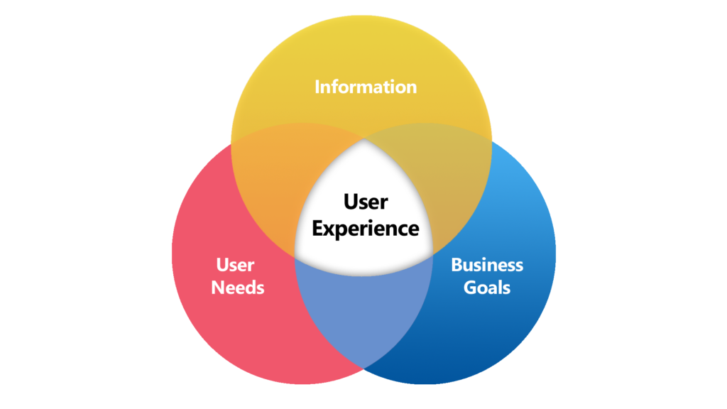
Salesforce is a powerful platform, no one is questioning that, but if it’s so amazing, why is it so hard to get users to use it? How come you have to retrain a business process more than once? Why is it so hard to find my records when I need them?
These sort of questions often pop up when speaking with leadership and end users who aren’t getting the most out of Salesforce. But rest assured, it’s not Salesforce, and it’s not your process (well hopefully). It’s most likely the case that you never set out to design a good user experience, one that promotes productivity, ease of use, and dare I say it, evokes enjoyment.
Creating a great user experience is more than what’s on the page layout, or what related list items are displayed. It’s about ease of use, ease of adoption, smooth workflow, and maintenance. Below I will walk through some tips for each area to ensure you have the tools to create a user experience that drives productivity without resistance.
Adoption:
Creating a user experience is the act of creating something users find intuitive to use. If you must spend 3 hours training a user on how to interpret what’s on their screen, then your design is flawed, and you will suffer with log adoption and resistance. When building a user experience, be sure to check off these areas.
Profiles:
It all starts with profiles, they allow us to define access, so that users are not overwhelmed with too many options right from the start. Profiles allow us to segment who sees which apps, fields, and components. Your profile should reflect the users’ expected job duties.
Apps:
Apps allow us to segment larger business processes down to views that make sense. If an object isn’t used by a team, then don’t let it take up page (and mental) space on their screen. When users log in to Salesforce, their app should give them a very clear idea of what their job function is, I.E, ” Enterprise Sales” or ” SMB Service” and so on. Here, “more is less” truly applies.
List views:
List views allow users to segment their work into categories based on their needs. Each list view should answer a question: “Which leads should I focus on today?”, “Which customers have the most urgent support needs?”. The list goes on. Simply put, ensure you are leveraging List Views that make sense for your team and their processes.
Lightning Pages/Page Layouts:
Users spend most of their time in Salesforce viewing and editing records, so don’t skimp on design here. A record page can easily get cluttered and feel overwhelming. When it comes to user adoption, make sure you work with your users to understand their needs, don’t just throw everything on the page.
Note: when working with a team that primarily works on Desktop, take advantage of Dynamic Page layouts and Dynamic Field Sections. These streamline processes by only showing relevant fields/components when they are needed. Generally, showing more than 25-30 fields on a page is considered overwhelming and cluttered. There are better ways to represent data!
Path Guidance:
Use Path Guidance! Salesforce Path Guidance is a feature that visually guides users through predefined stages of a business process. Displayed as a bar at the top of a record page, it shows the current stage and necessary actions. This helps users follow consistent workflows and input accurate information. Administrators can customize stages and associated guidance, enhancing user experience and reducing errors. Overall, Path Guidance streamlines processes and ensures efficient progress tracking within Salesforce. It’s so simple to setup and keeps users from feeling overwhelmed by ensuring they always know their next steps and relevant fields needed to complete the process.
Workflow:
After user adoption is improved, the next question to ask of your UI is “Does it support a seamless workflow?” Can users complete their processes from A to Z all in one app? When creating your User Experiences, keep these things in mind:
Switching Records wastes time:
If users need to switch records to see all the relevant data to complete a step in their process, they may be wasting time clicking through records. Consider the following tips:
- Use the Related Record action to make data visible to users: Consider a Case record that has relevant Account data right there on the screen, no need to click away, simply view or update those account fields right from the case.
- Use a Console view: If you must switch records to complete a complex workflow step, then be sure your team is leveraging the console view, it allows you to have multiple records open with easily switchable tabs (think browser tabs, but without cluttering up your browser).
Automate Handoffs:
Okay, this one is less about the Visual UI, and more about the General User Experience. If a user has to break their concentration to hand off a work item to another person at the company, this slows them down, and kicks them out of the groove. Consider leveraging automation to enhance the User Experience:
- User Approval processes to skip over long email chains
- Leverage Flow to ping another user/team in Slack, or via email.
- Escalate to CS with a click, not a phone call.
- Leverage Flow Orchestrator to handle multiuser processes seamlessly
Keep it all together:
This was mentioned in the “Apps” section above, but it’s worth stating a second time: keep your apps Workflow specific, it helps with user adoption, but it also helps with user efficiency! If it’s not needed for their process, it’s not needed in their App!
Maintenance:
We all know that companies are constantly evolving, and this means we want Salesforce to be able to evolve and grow with us. This means we need to build out our UI to be scalable and easy to change when the time comes.
Keep organized:
Knowing that we will need to make updates, create new UI experiences, and remove older ones entirely. It’s important to keep things organized with proper naming and description fields. Don’t slack off when naming page layouts or labeling Related Record actions. This can cause major confusion down the road when you’re trying to innovate in your Salesforce.
Know best practices:
This can be hard, but knowing what Salesforce’s limitations are is a vital part of maintaining your Salesforce, not just its UI, but the platform. If you drive your dads 1967 Ford at 150MPH, it’s not going to end well, the same can be said if you pack everything imaginable into one Sales app, or your one account page layout. Your page performance will suffer, resulting in slow load times and frustrated users.
Conclusion:
The user experience can either be the best or worst thing about Salesforce for your users.
It can make their work lives seamlessly easy, or unnecessarily difficult. So next time you are bringing in a new business process or refining a current one, be sure to build a user experience that does the heavy lifting for you. Lastly, talk to your users and gather their feedback. They will surely let you know what information is critical for them to see, and what is superfluous. They will thank you for it!


